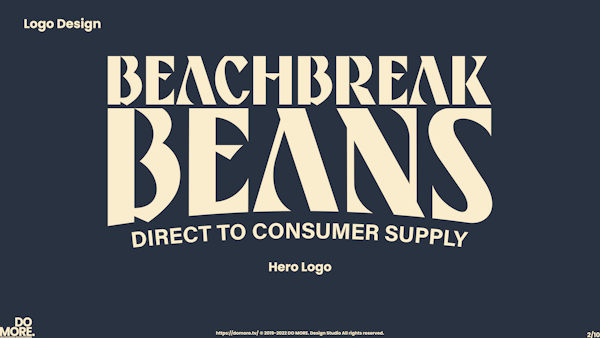
BEACH BREAK BEANS
Beach Break Beans is a coffee roaster that started production in 2018 in Amsterdam, NE. Their goal was simple, to create a coffee that “you brew after you just had a good surf on a sunny day.” And while that seems simple enough, the reality of starting a successful coffee company is hard enough without having to worry about solid branding and messaging. The founder Rutger says -“Taking a sip of filter coffee and talking about flavor notes like bergamot or fermented papaya can be fun for specialty coffee roasters but let’s be honest: the only thing you want to taste is really good coffee and good vibes.”- Therein lies the color scheme. We adopted colors that we would later call Juicy Mango, Dried Papaya, and Bergamot Citrus. So we got hard to work at creating an identity system that adhered to Rutgers's desire for a brand with “good vibes” while also remaining approachable and easily identifiable.
We started off by researching what small-batch coffee roasters there were in Amsterdam and what their aesthetic was. We noticed right off the bat that there were a good number of coffee roasters in Amsterdam, especially in the same area as Beachbreak Beans. One thing that they were all missing though was that "je ne sais quoi" that really embodied the soul of the surfer.
The next step was to do a few user surveys to see what the community thought about a coffee roaster that wanted to focus more on the quality and flavor of the coffee and less on what special way it was roasted. After asking them this, we asked them what they thought this coffee brand would look like. It would be an understatement to say that the responses varied so much in a way that it was hard to draw any conclusion. With what information we had, we moved to the next stage of prototyping the brand identity.
FIND THE FULL PROJECT HERE
FIND THE FULL PROJECT HERE

